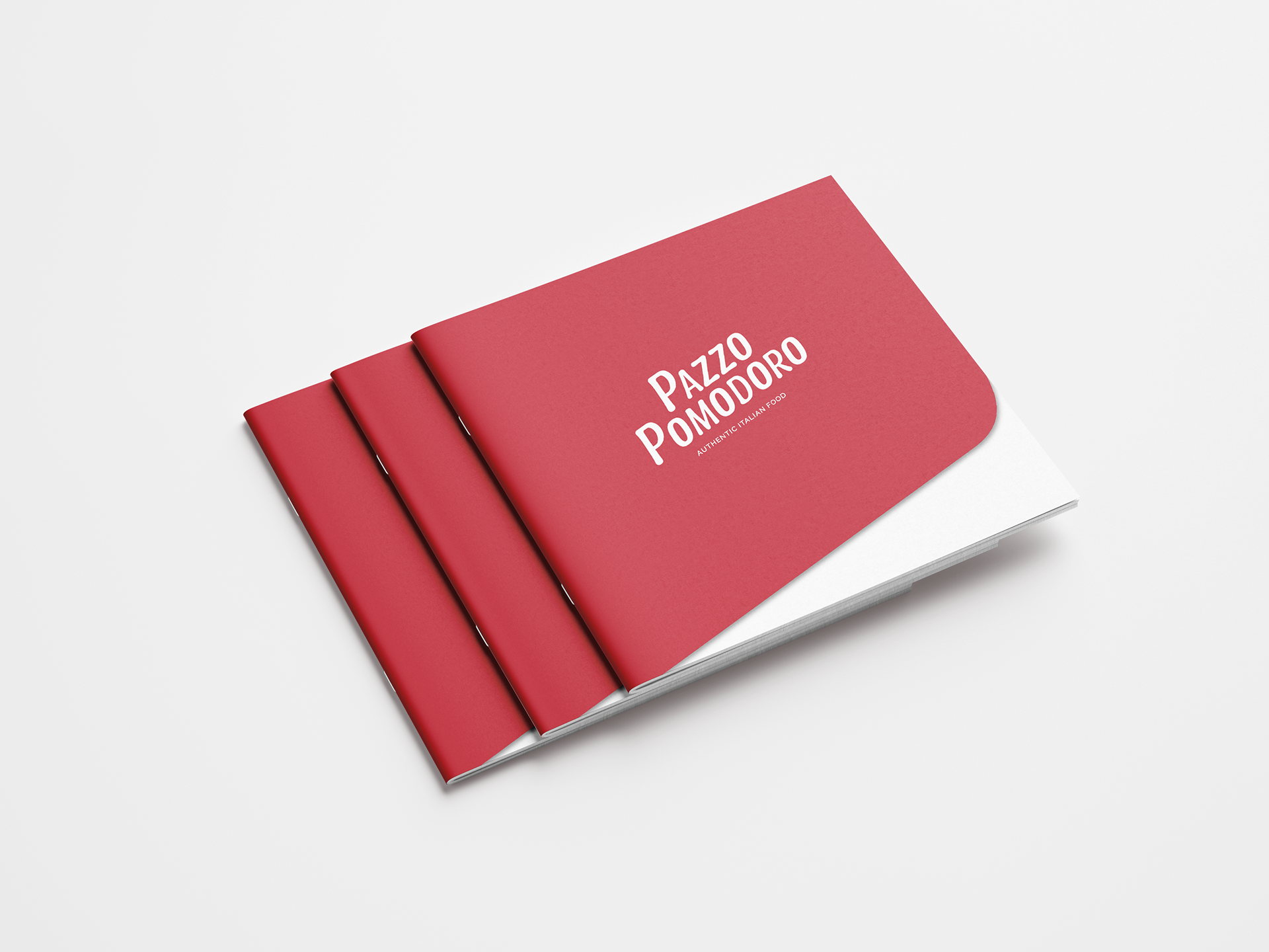
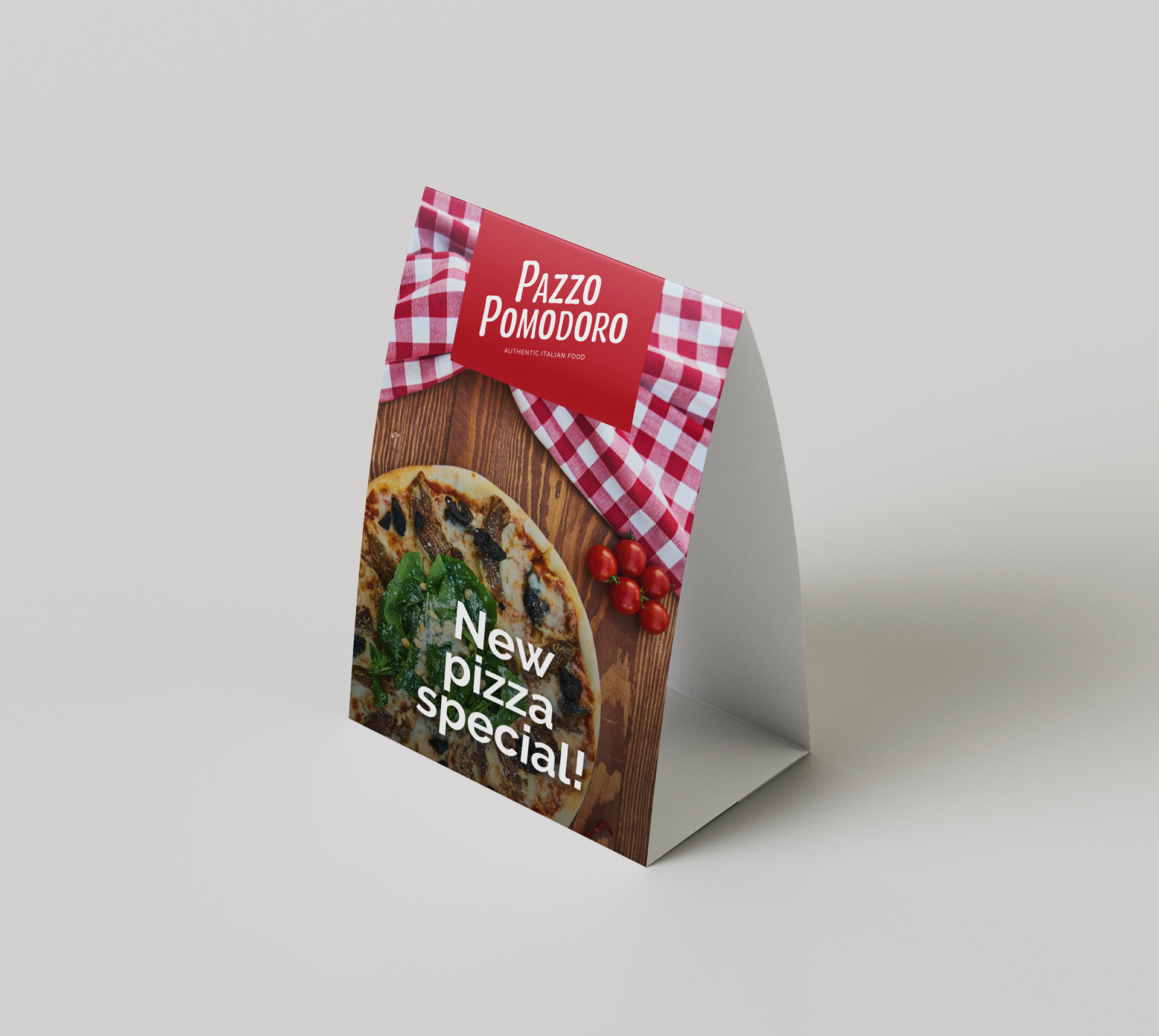
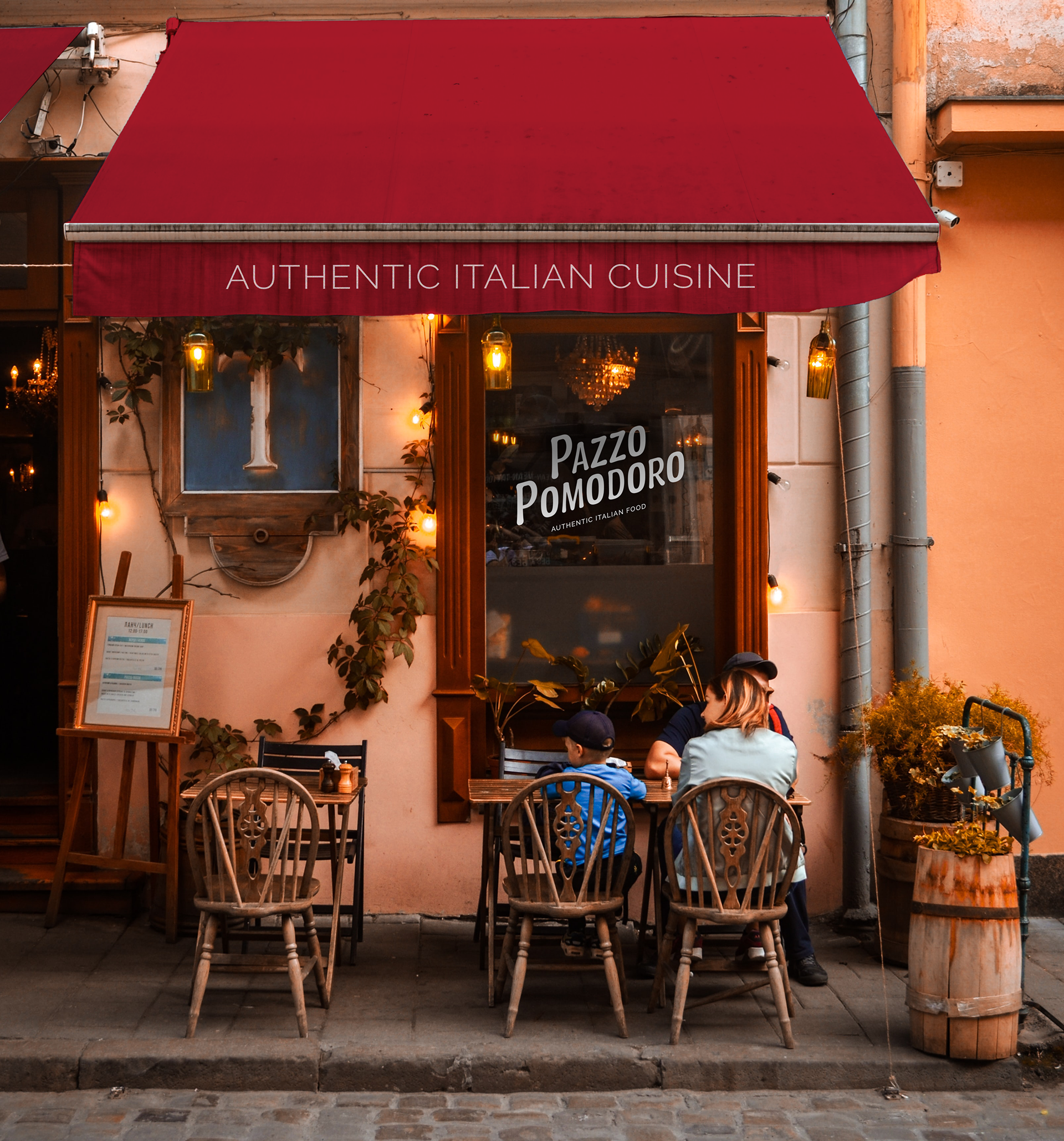
Pazzo Pomodoro, or the “crazy tomato,” is a Cantina style Italian restaurant that serves traditional dishes made-from-scratch. Redesign the logo, branding, and menus of a local mom & pop restaurant of the student’s choice.
Scope: redesign the logo and menu of Pazzo Pomodoro.


Process
The goal of the project was to portray a five-star restaurant look while keeping the style and personality of the original brand. To accomplish this, I studied the background story of Pazzo Pomodoro, visited the place in person, as well as conducted research on the standards of Italian typography and branding. We had the limitation of only using type to express the essence of the brand.
Below I included some digital roughs that lead to the current logo.
Logo evolution
The top logo is the original design, while the bottom one is my final logo creation.
By using a slanted orientation and a rounded font, I managed to keep the friendliness and playfulness the original has in a more subtle way. Also, I used a darker shade of red to make it more professional.