A small town Kindergarten teacher has developed a line of edible art supplies out of frustration from telling her students not to eat their paint. The new line of products is non-toxic and comes in a variety of flavors. She has chosen finger paints to be the kickoff product for her new line of art supplies.
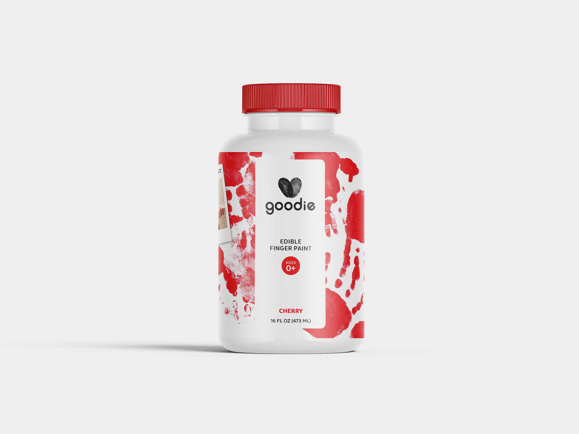
Scope: Design and create the branding and a set of labels for the plastic containers needed to contain the product.
Concept
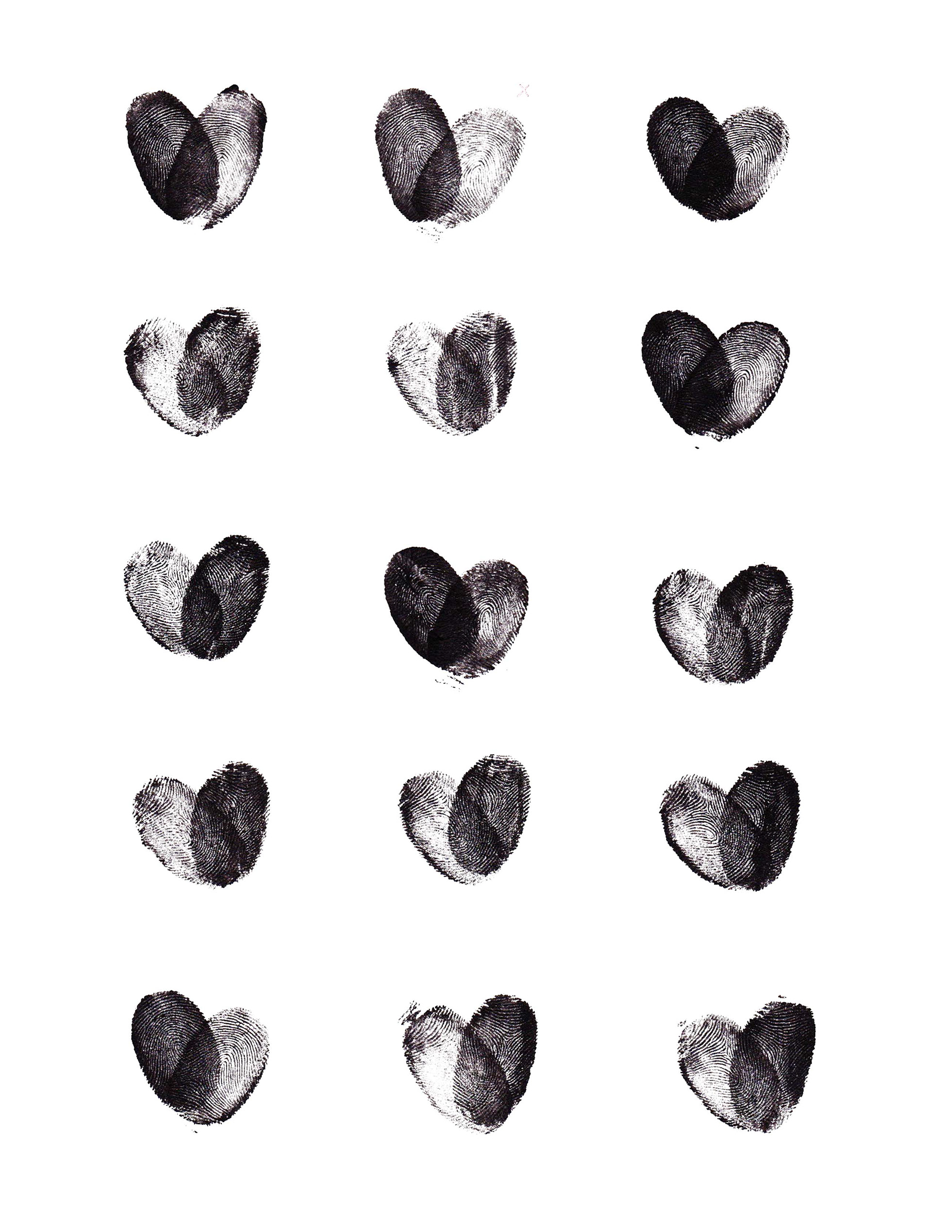
The logo was constructed by the juxtaposition of two fingerprints, the teacher's and the kid's. The fingerprints are slanted in the way they shape a heart. It symbolizes the three key words the brand tries to portray: love, care, and protection.
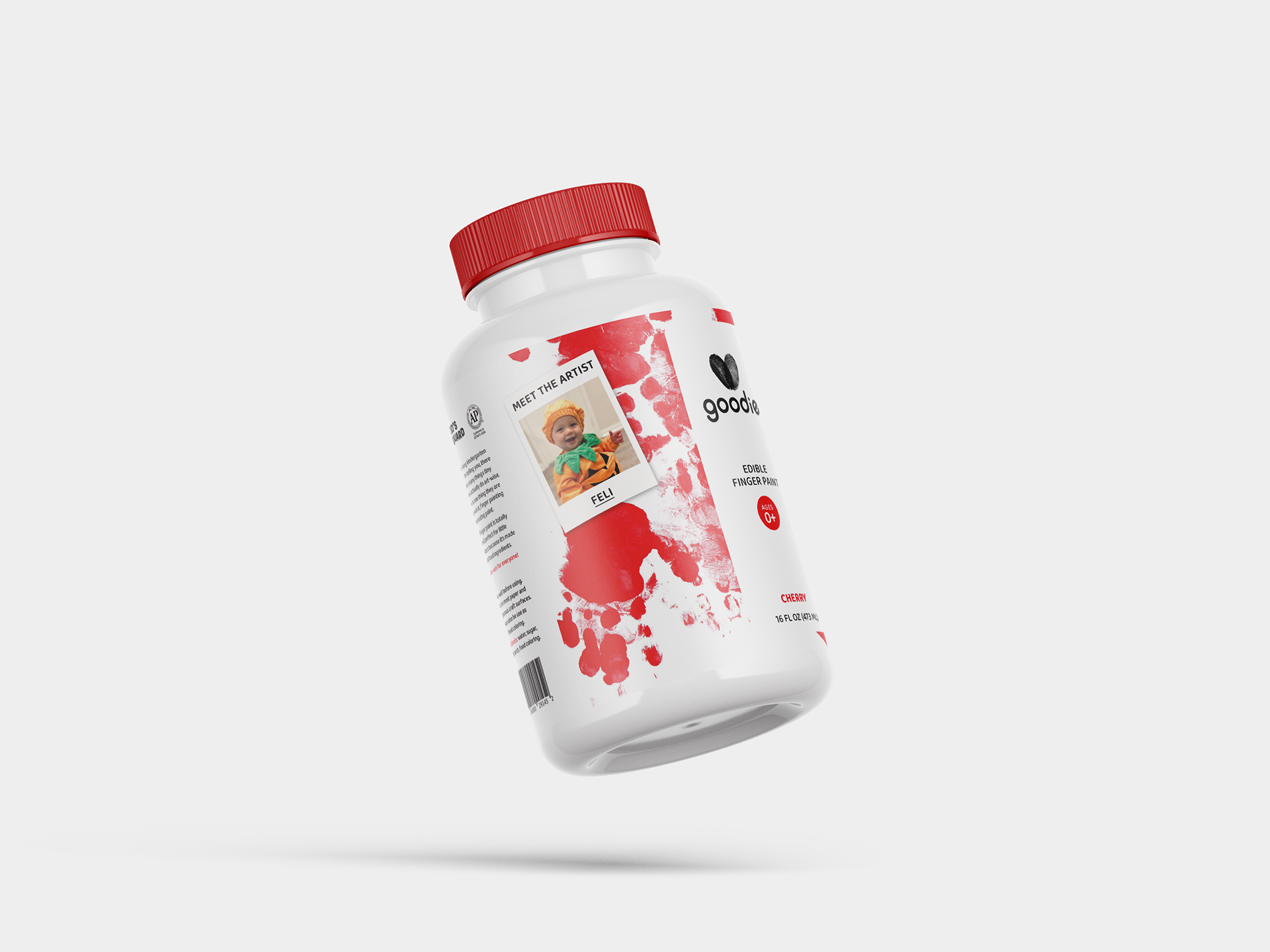
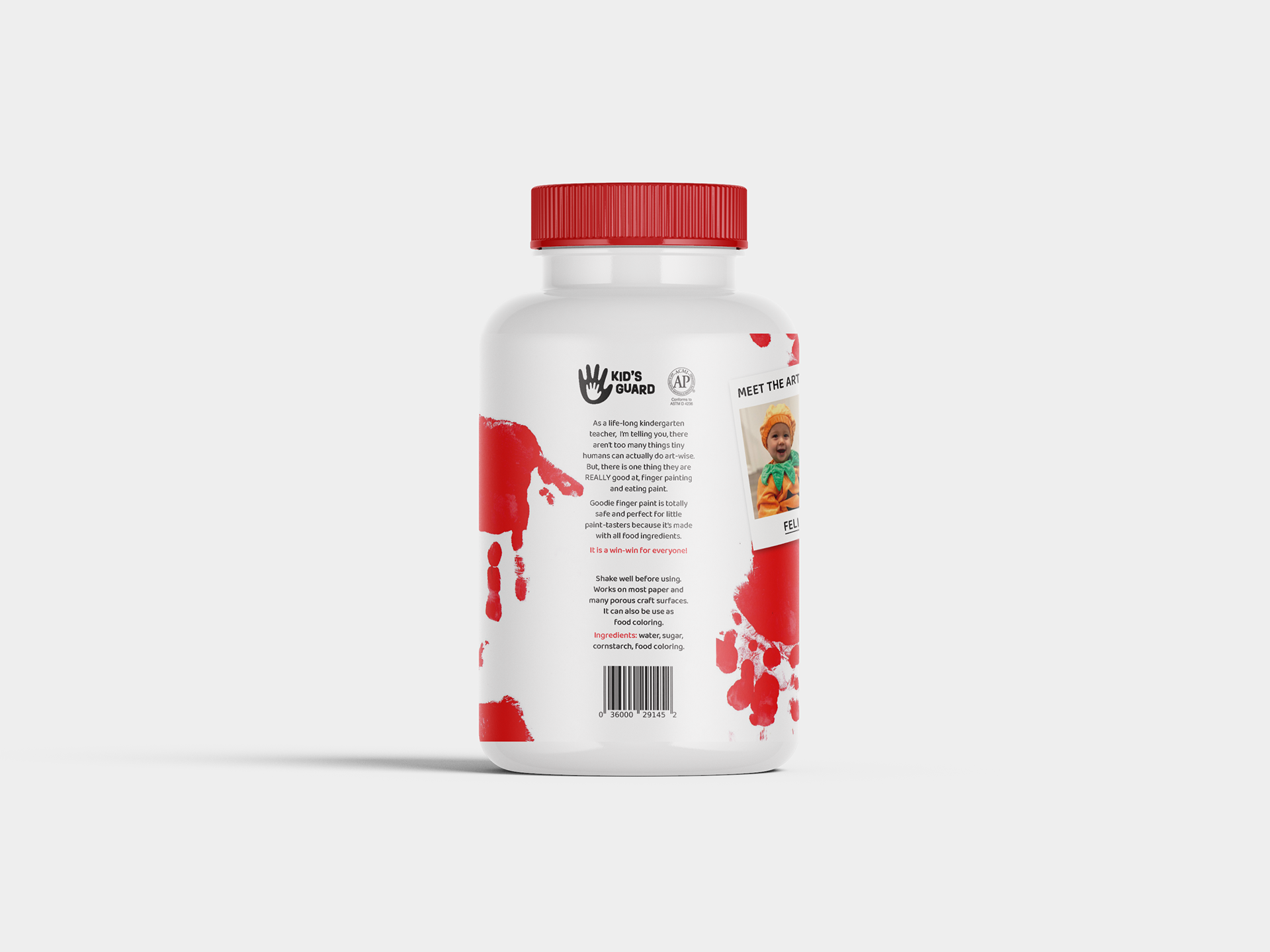
Being a kindergarten teacher with access to various groups of kids of different ages, I thought it was a great idea to make them part of the branding project. Therefore, I decided to use their artistic traits in the design of the label. What's better advertising than the actual product in action. With the written authorization of the parents, I even included a picture of the "artist" on the label that would delight any parent's heart (who makes the purchase of the product).
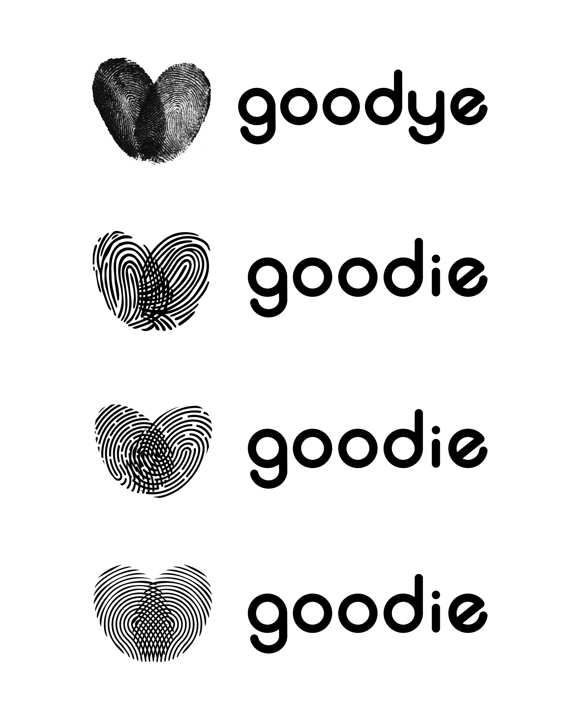
Logo construction
In order to find the perfect logo, I analyzed a series of logo variations in terms of medium, shape, tone, and composition.
