The European Travel Commission is an association in the European travel sector. Its mission is to strengthen the sustainable development of Europe as a tourist destination.
Scope: redesign the cover, table of contents, infographics, and two spreads from the annual report of a travel company of the student's choice.
Analysis of original
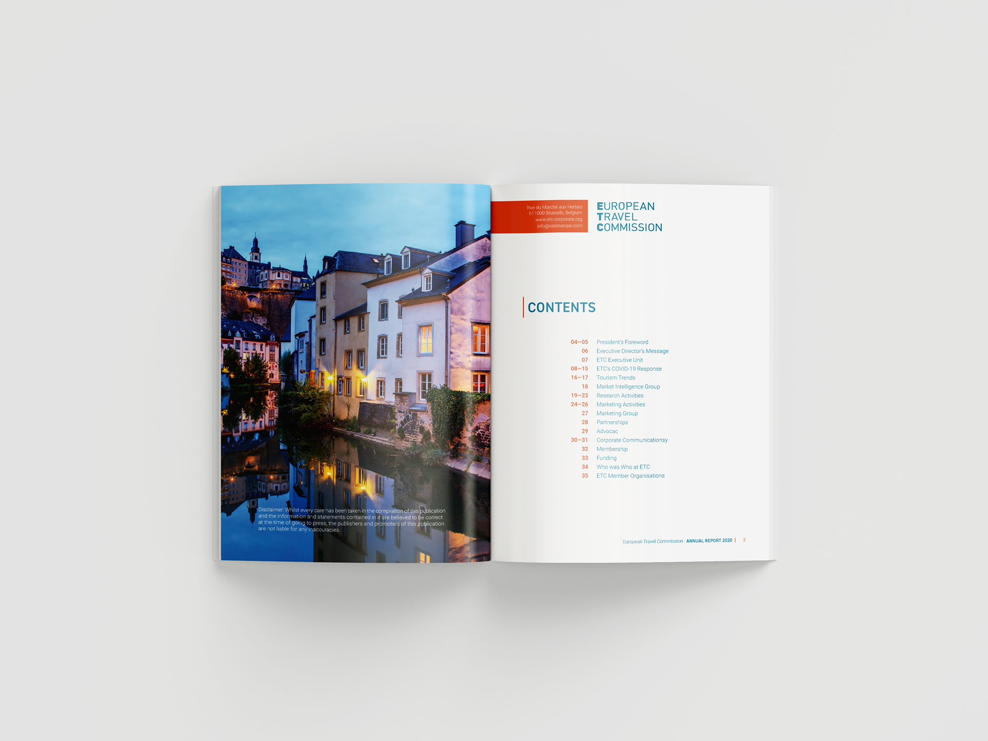
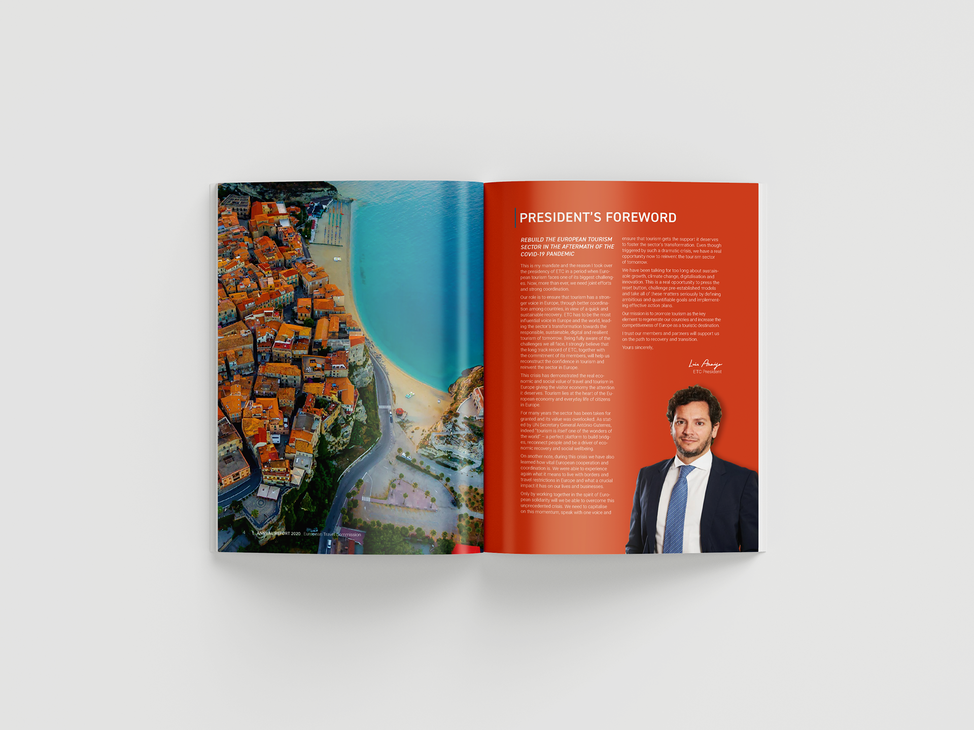
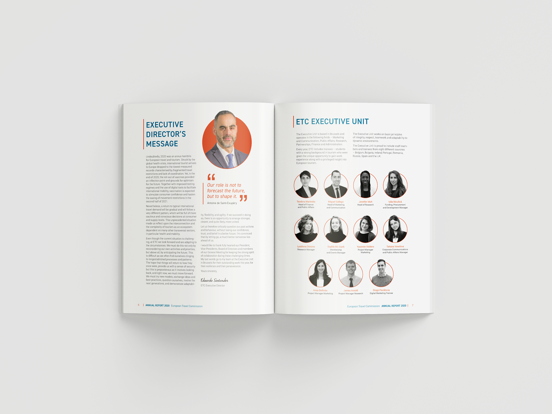
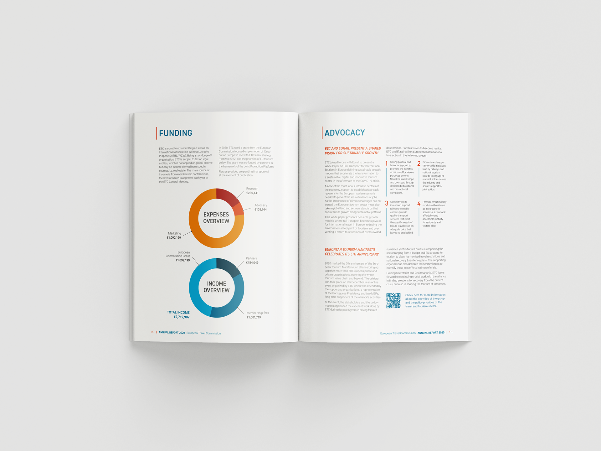
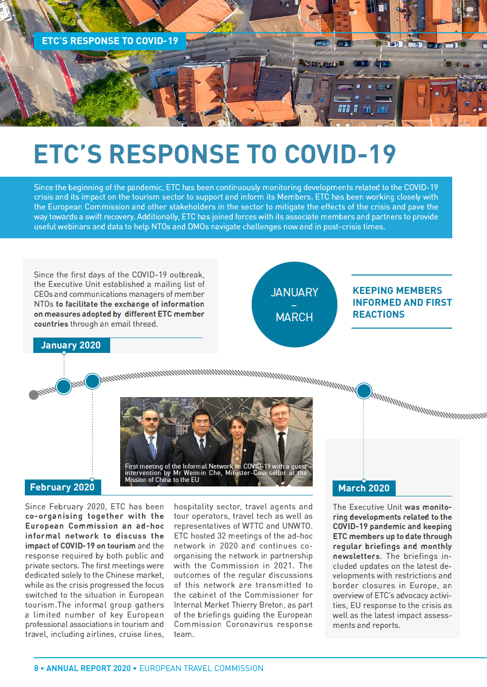
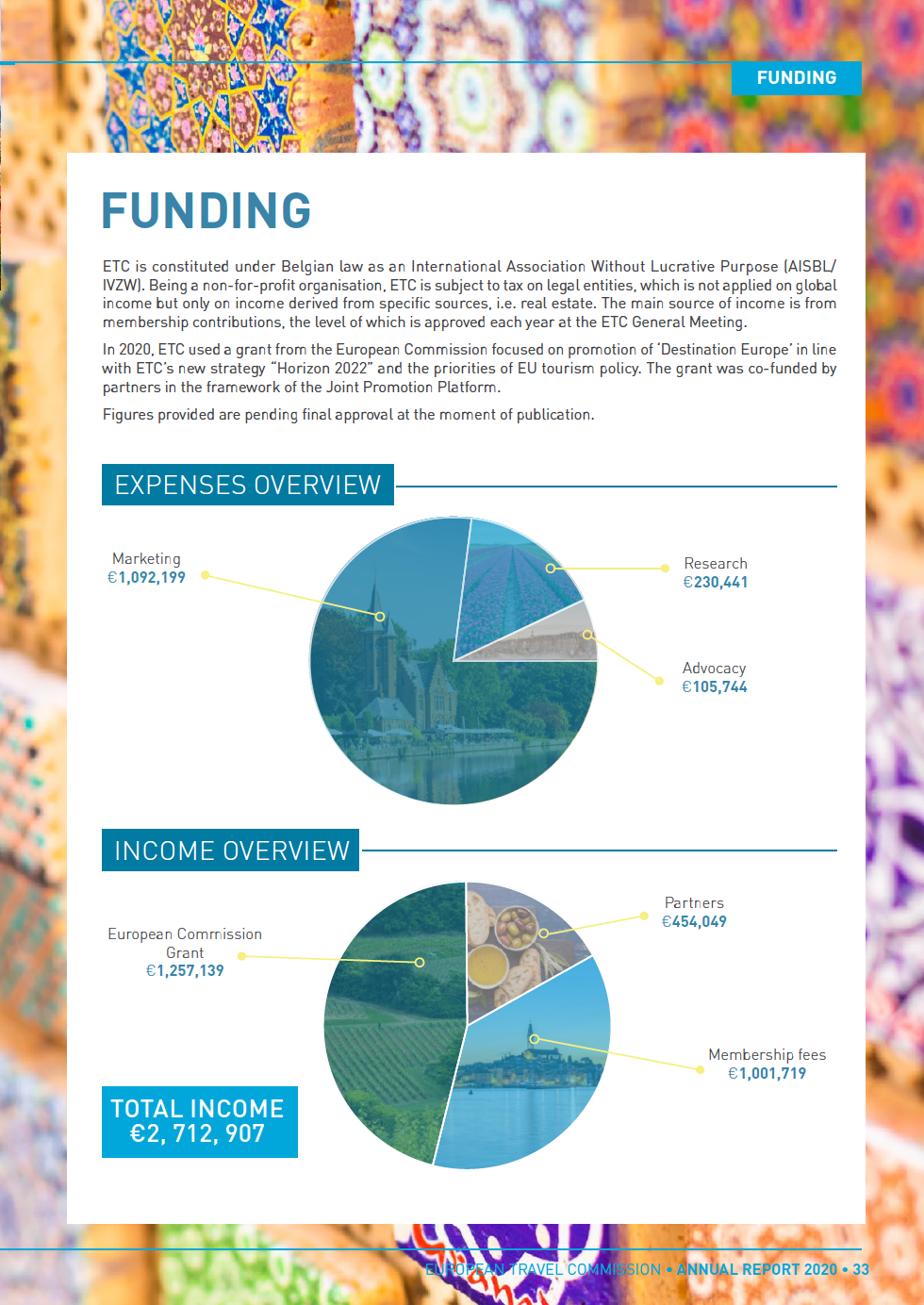
The original annual report from the European Travel Commission has a lot of colorful, eye-catching, and high-quality imagery that I reused in my redesign. The report also has a lot of infographics, maps, timelines, and illustrations that could be done better.
The theme of the report is very business-oriented. The color palette uses a muted dark blue and a brighter cyan, which I find a little cliché. Therefore, I added a muted orange to brighten it up. The design style feels very outdated, especially in terms of layout. For the most part, it uses a 2-column layout and a really thin gutter, which makes the report feel crowded. The negative space is mostly inexistent since there is no space left for margins. Sometimes, images are used as backgrounds making the type on top hard to read.
Typographically speaking, there is plenty of room for improvement. The text is justified making the page layout look rigid.
Overall, the report has the potential to be better designed, more interesting and dynamic, and more approachable to the public.
Newsletter
The project included the design of a separate newsletter for the company.
Trade Show Booth
The second part of the project, which is still in progress, was to design and build a prototype of a trade show booth for the same company.