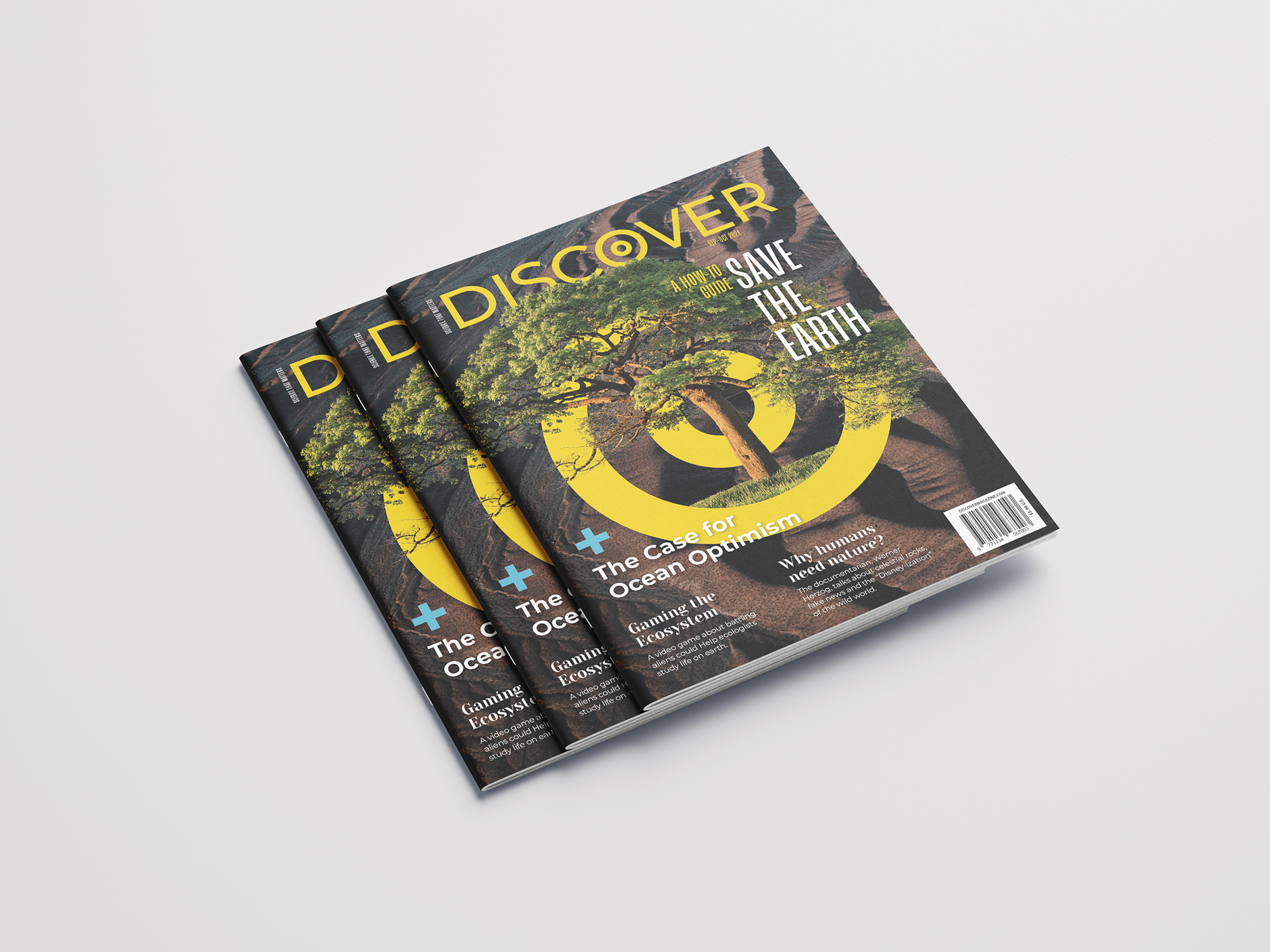
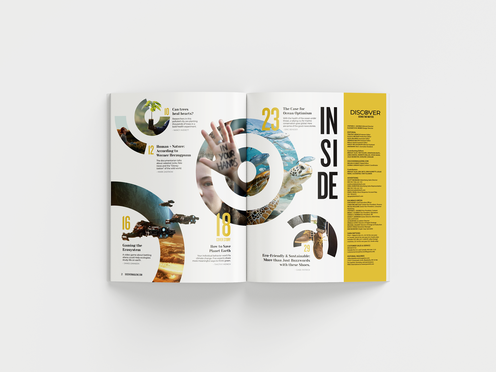
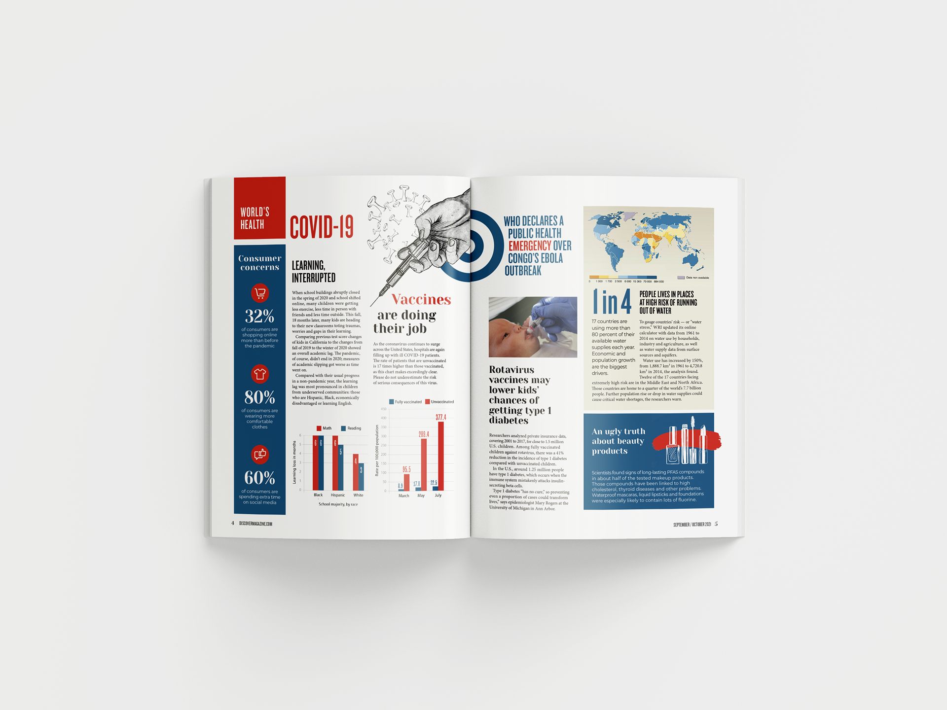
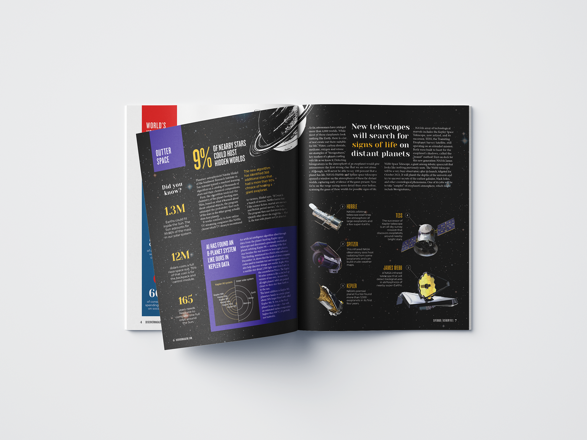
Discover is a monthly magazine that reports developments in science, medicine, technology, and the world around us. They claim their audience to be everyone, but the style is outdated and it is unlikely it'll attract younger demographics. Therefore, I decided to use more modern and visually interesting layouts and graphics.
Scope: redesign of the nameplate, cover, table of contents, briefs section, and two features.
Analysis of original
Discover could fit into multiple genres, such as science, medicine, and technology. It basically tackles any latest news, trends, issues, theories, and developments in the world around us. Therefore, it is intended to a broader audience, as they state on the website, “Science should be for everyone.” Although this magazine is science oriented, it is an easy-to-read magazine, uses language understandable by the average magazine reader, translates scientific concepts, and follows a conversational tone to maintain a non-expert reader engaged. It also limits its featured stories to 600 to 1,200 words. The frequency of this magazine is 8 issues per year, which makes it less frequent than other science magazines.
Overall, Discover has the average magazine layout and style with not many distinctive graphics on it. As a good design choice, I think the logo has a nice National Geographic look to it, and the typeface used has an interesting duality between a retro and a futuristic style.
Among the things I consider as bad design choices, the cover composition is one. Image and color choices are a little flat and outdated. The feature titles could be distributed more interestingly around the page with greater hierarchy between them. The table of contents is too static, and some images choices do not relate with the topic introduced. Different fonts, colors, and column count are used for the headlines under a same department. I believe there should be more consistency among them.
Another bad choice are the ads. Although they are trying to appeal to a general audience, I think the ads are too broad and very ugly designed. They ranged from New England Cruises to a stainless-steel knife, to a three-stone wedding ring. Perhaps, they should limit them to new technologies and medicines.
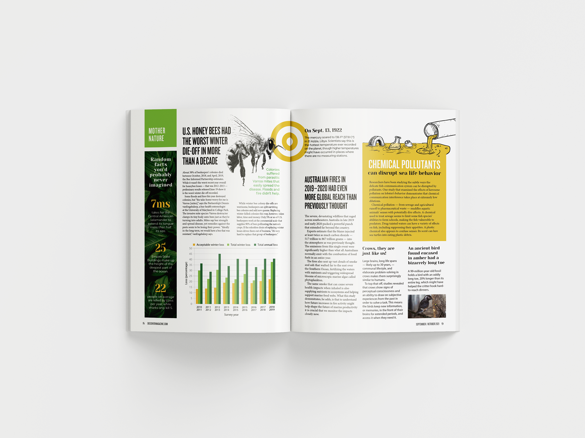
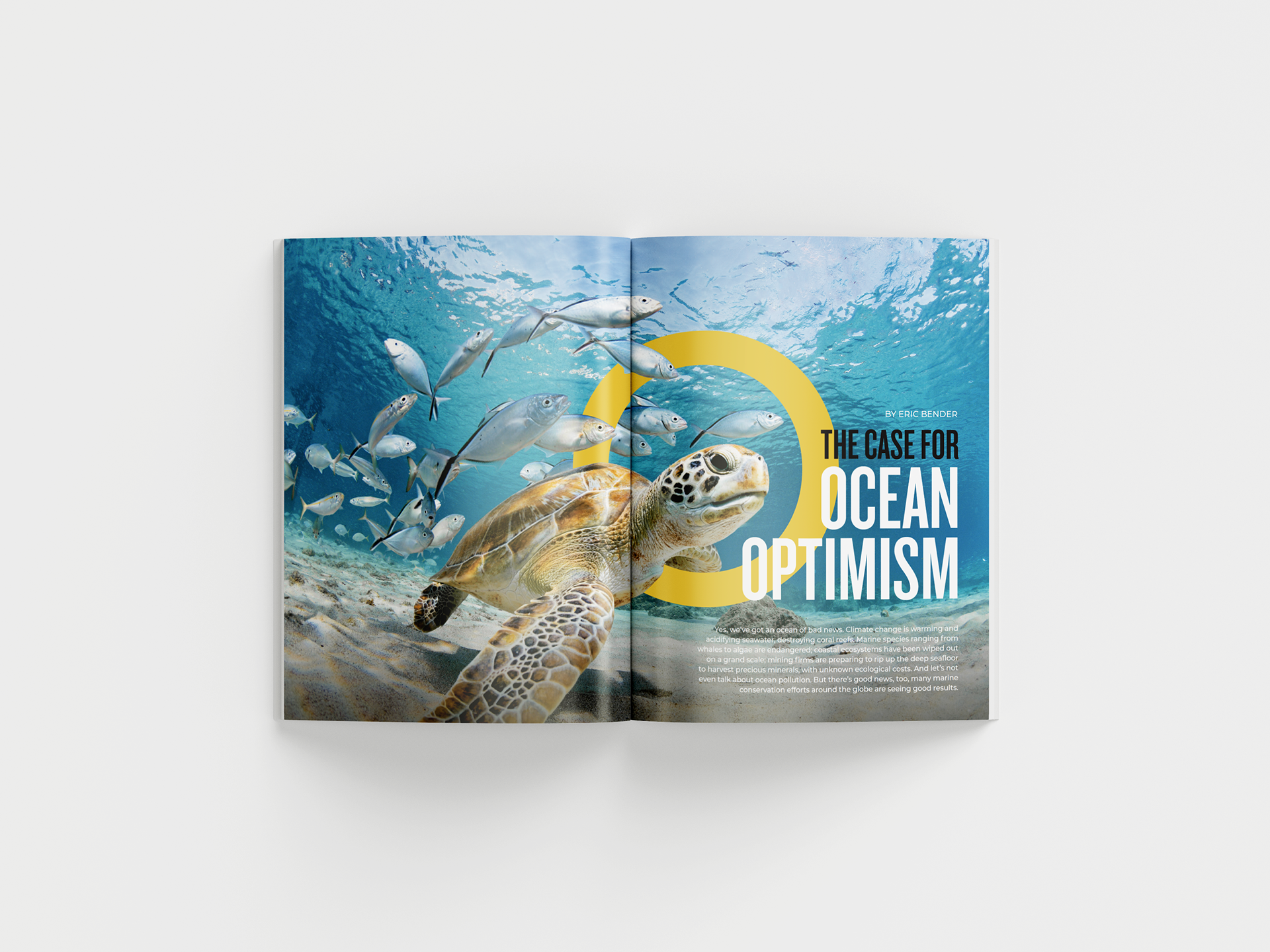
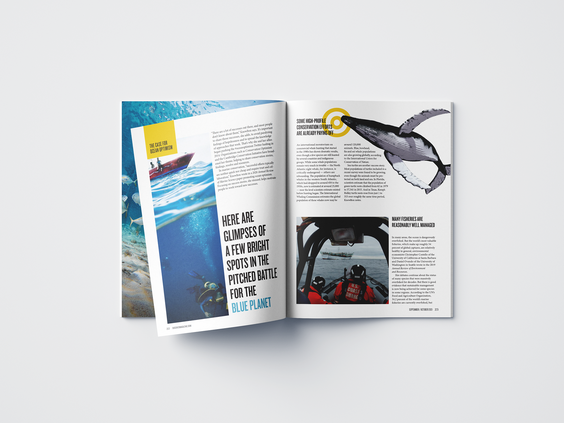
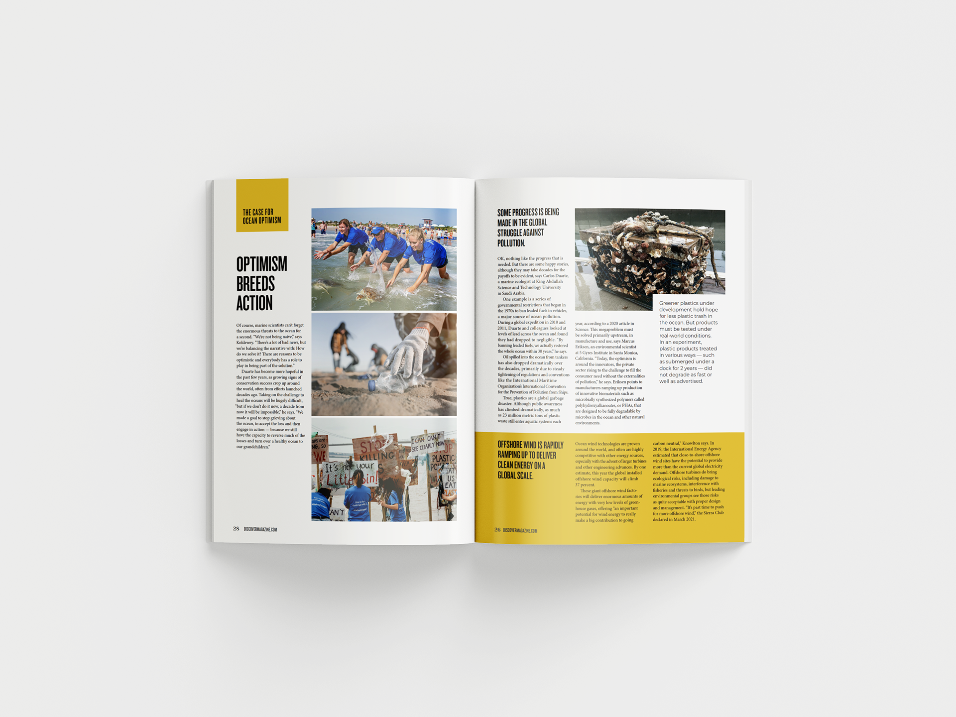
Honestly, I think this genre has a lot of potential for a very infographic style that is timeless, but at the same time connects the past, the present and the future. I would probably keep the vintage essence of the brand on the typefaces but arrange them into more modern compositions. I also want to make the inside of the magazine more visually interesting with better images and layouts.